How Color Affects Mood in Interior Design, Room by Room

I think I started when I was about eight or nine when I painted my bedroom wall gold. A gold metallic paint. Which, by the way, in the fifties was not easy to find. I could not go to Amazon. I could not go on the internet and find it. I had to really search and get somebody to take me to a hardware store. And everyone thought I was very strange.
I was actually probably eleven or twelve. I did it when my mother did not know. I had the paint and everything, and I painted a little bit at a time. She came in my room, and I would distract her. Let me tell you something: it is not easy to cover gold metallic paint. When somebody moves in and you sell, it is not easy.
Worth the scroll
- ↓The color that makes dinner look better and linger longer
- ↓The safest bold paint choice in the whole house
- ↓What Florida sun does to a paint chip overnight
What color does to a room
I always had that, and I still do. When I go into somebody’s home, I sit there and I think of ways to change it. If I go into a hotel room, I like to change it. It is something in my mind that I cannot stop.
That gold wall was not subtle, and it was not practical for resale. But it made the room mine. Color works before we explain it: it can wake a room up, soften it, warm it, or make it feel darker than the square footage suggests.
The rule underneath all of it: start with the light
I like bright. I like natural light. That is a must. My mood changes when I am in a dark space. Now, when I say dark space, if I am in a cute little quaint pub, a restaurant that has great chandeliers and candles, I am fine with that. But I like lots of windows, lots of light. I do not want to be in a space that does not seem bright.
I would say eclectic. I like a mix. Right now I am looking for a cool vintage piece that could be something from the sixties or seventies. I want a table for the living room to go between those two blue chairs. I want something that is more of a conversation piece. I want to add more warmth to that little area.
I am not a beige girl. Now, if you are beige and you have fantastic artwork and fantastic accessories, then that is a whole different thing. That is a clean look, and I am talking amazing artwork and a major theme, introducing some black and whites and fresh flowers with color. I am fine with that, but it has got to be done in the right way.
Before choosing a paint color, look at the room in the morning, afternoon, and evening. A north-facing room can cool a color down. Strong western sun can make the same color feel much warmer. Lamps change it again after dark.
Paint a large sample on two walls and live with it for at least two days. A tiny chip under store lighting cannot tell you what a whole room will do.
Red, orange, and yellow bring energy
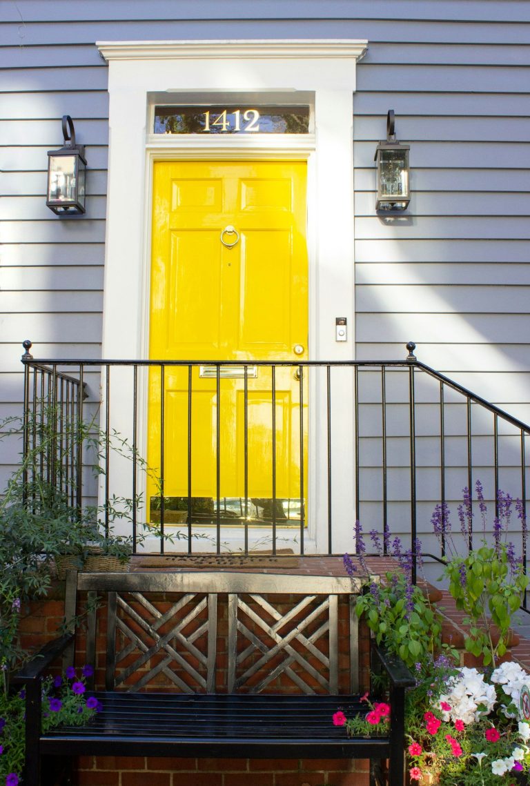
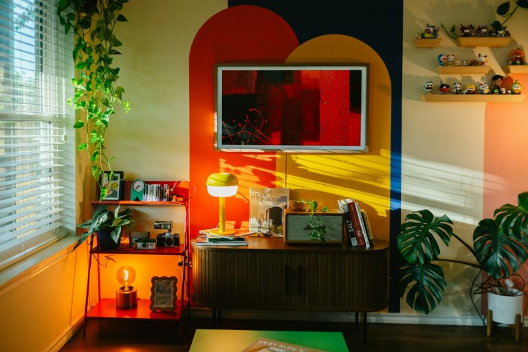
Red and orange pull attention. In a dining room, entry, powder room, or one piece of furniture, that energy can feel warm and social. Across every wall of a bedroom, it may feel like too much. Brick, clay, rust, and terracotta are often easier to live with than the brightest versions.
Yellow can make a kitchen or breakfast area feel cheerful, especially when it is soft rather than sharp. If you love a strong lemon yellow, try it first in flowers, artwork, a chair, or a bowl you can move.
Blue and green make room for calm
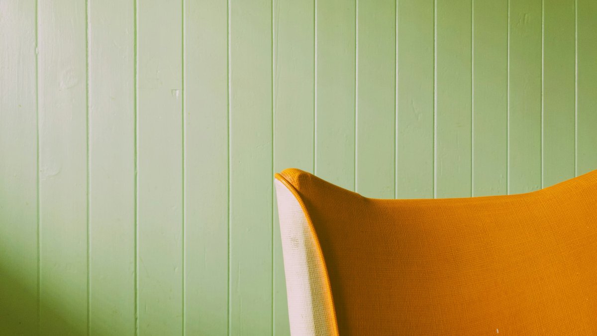
Blue is an easy bedroom and bathroom color because it can feel quiet. Green is almost a neutral to me because we are used to seeing it everywhere outside. Sage, olive, dusty blue, and blue-green can all bring color without making the room shout.
The warning is the same: watch the light. A cold blue in a dark room may feel gray. A green with too much yellow may become much brighter in Florida sun.
White and beige need something to say
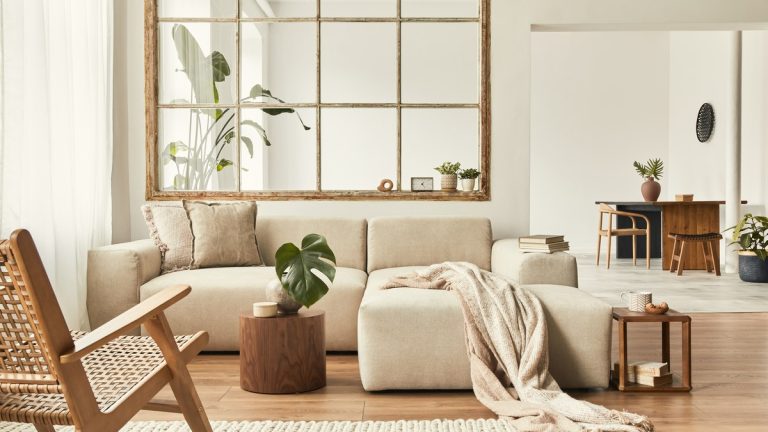
A neutral room is not automatically boring. It becomes boring when nothing else has a point of view. Texture, wood, art, black-and-white details, plants, books, and one strong color can give a quiet wall a reason to exist.
When somebody owns a house and has been there twenty-five years, and they have done nothing in twenty-five years, you are selling as is. It is a gut job, unless somebody has the same exact taste that you had twenty-five years ago.
When you own a house, if you are buying something with the intent of not staying there forever, try to keep it in mind, but be happy. In your color choices, do what you want to do. In your kitchen or whatever, you can stick with the white cabinets, and you do your backsplash. Do what you want to do to be happy.
That is the balance I want homeowners to understand. Keep expensive, permanent choices in mind, but do not make every room look as though nobody lives there. Paint is one of the easier things to change later.
Choose color room by room
The map
The warm side and the cool side
Every color in the house pulls in one of two directions. Pick the direction before you pick the chip.
Warm: energy, appetite, talk
- Red: dining rooms, front doors, small doses
- Terracotta and orange: family rooms, gathering spaces
- Soft yellow: kitchens and breakfast nooks
- Brown and wood tones: anywhere that needs grounding
Cool: calm, rest, focus
- Soft blue: bedrooms and bathrooms
- Navy: offices, dens, kitchen cabinets
- Sage and olive: the safest bold choice in the house
- Lavender: bedrooms and reading corners
White sits on whichever side you push it. Creamy whites lean warm, blue-whites lean cool, and texture decides whether either one feels like a home.
Help people visualize the finished room
If you have a vacant apartment, on Zillow you can stage it, saying that this has been staged. Take those photos with you. Then you can go into the room and say, see how this can look? Visualize this right here. Sofa here. Are you coming with furniture? Are you buying new furniture? Let them visualize their furniture or what that room could be.
People do not stage with actual furniture as often anymore because that costs money. You have got to deliver the furniture and rent it. And what if they stage it modern or contemporary and the buyer says, I hate that furniture? They are going to remember. You have got to improvise. When you see the before and after online, it can look great.
A staged image is not a promise about how a paint color will behave in the real light. It is a way to begin the conversation. The sample still has to go on the wall.
Color also affects how a home shows
Everything has got to be in place. Fresh flowers, candles burning with nice scents. For me, having people over, you do the best you can, whether you are having dinner or drinks. Have nice serving glasses, nice serving pieces.
You are bringing them to your home, and you want them to feel good. I want them to enjoy their evening, like they are in a nice restaurant or a nice cozy club.
Color is easier to understand when the room is not competing with every object the owner has collected.
When you are getting ready to show your place, make sure everything is minimal. Clean your counters up. Do not be stacking your appliances. We do not need to see every appliance that you own on top of your cupboard, because it is too confusing. Hide everything. Put it in storage, whatever, but anything you do not need, keep it clean. When somebody comes in and sees clutter, the buyer gets turned off.
Before kitchen photographs, keep it uncluttered and clean. Uncluttered and inviting. Put out a fresh bowl of fruit, a fresh bowl of lemons, something happy. Have flowers.
Do not have personal photos. People’s eyes go to that instead of what they should be looking at. No distractions. You can even play some very soft classical music. Make it inviting, so when they leave they say, wow, that was so nice. People remember the little touches.
You do not need to remove every trace of personality. You do need to remove distractions. Let the room have one clear feeling, test the color in its actual light, and use the things you love enough to live with.